


Businesses collect enormous amounts of customer data, but collecting data is only the beginning. The real value comes from understanding what that data says about customers and using those insights to improve products, marketing, sales, pricing, customer experience, and business performance.
In this article, I want to walk through a practical example of customer purchase behaviour analysis using Excel.
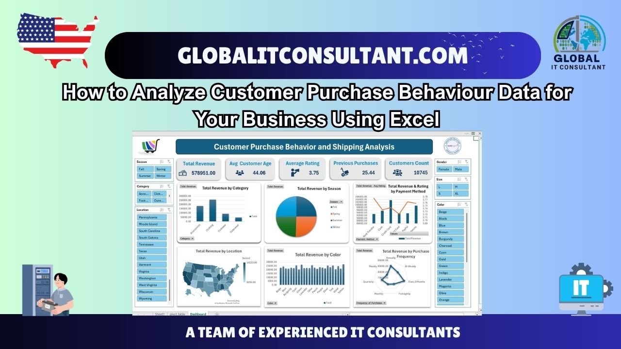
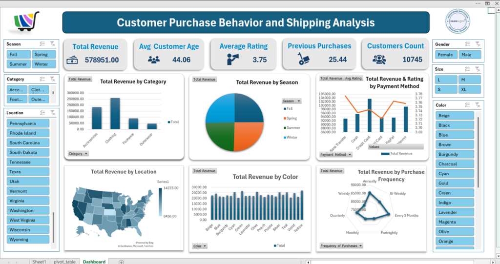
The dashboard shown in this analysis brings together customer demographics, purchase frequency, payment methods, seasons, product categories, locations, colours, ratings, and revenue. It demonstrates how a relatively large customer dataset can be transformed into an interactive analytical dashboard.
At Global IT Consultant, our Data Analytics Consulting approach focuses on helping businesses turn complex information into actionable insights through dashboards, analytics, and predictive models. Global IT Consultant
The objective is not simply to create attractive charts. The objective is to answer important business questions.
What Is Customer Purchase Behaviour Analysis?
Customer purchase behaviour analysis is the process of examining customer data to understand how customers interact with a business and its products.
Depending on the dataset, this can include analysing:
- Customer age
- Gender
- Product category
- Purchase frequency
- Previous purchases
- Purchase amount
- Payment method
- Customer ratings
- Seasonality
- Geographic location
- Product colour
- Product size
- Customer preferences
When these dimensions are analyzed together, businesses can identify patterns that may not be obvious when looking at individual transactions.
For example, total revenue tells you how much money the business generated.
However, revenue by category can tell you which categories contribute the most.
Revenue by season can reveal seasonal purchasing patterns.
Revenue by location can highlight stronger geographic markets.
Purchase frequency can show how regularly customers return.
This is where customer analytics becomes much more useful than simply maintaining a transaction spreadsheet.
What Should You Analyze in Customer Purchase Data?
Before creating charts, I recommend starting with business questions.
Instead of asking, “Which chart should I create?”, ask:
Which Products Generate the Most Revenue?
A category-level analysis can show whether customers are spending more on clothing, accessories, footwear, outerwear, or other product groups.
In the example dashboard, revenue is compared across product categories using a column chart.
This immediately makes category performance easier to understand than a long table of transactions.
If one category contributes substantially more revenue than another, management can investigate why.
Is demand higher?
Is the average order value higher?
Does the category have more customers?
Does it have better repeat-purchase behaviour?
These questions lead to deeper analysis.
Does Customer Behaviour Change by Season?
Seasonality is another important dimension.
The dashboard includes a visual showing total revenue by season, allowing the business to compare Fall, Spring, Summer, and Winter.
This type of analysis can help businesses identify periods of stronger or weaker demand.
For example, if revenue consistently increases during a particular season, marketing campaigns and inventory planning could potentially be adjusted accordingly.
However, I would not make a decision based on one visualization alone. Seasonality should ideally be examined across multiple years to determine whether the pattern is consistent.
How We Created This Customer Behaviour Dashboard in Excel
The dashboard was designed using an Excel-based analytical approach.
The first step is to organize the underlying customer dataset into a structured table.
Each row should represent a customer transaction or relevant customer-level record, while columns represent measurable attributes.
For example, the dataset can contain fields such as:
| Data Dimension | Example |
|---|---|
| Customer | Customer identifier |
| Age | Customer age |
| Gender | Male/Female |
| Category | Clothing, Footwear, Accessories |
| Location | State or region |
| Season | Spring, Summer, Fall, Winter |
| Payment Method | Credit Card, Cash, PayPal |
| Purchase Frequency | Weekly, Monthly, Annually |
| Rating | Customer rating |
| Previous Purchases | Number of previous purchases |
| Revenue | Purchase value |
| Colour | Product colour |
| Size | Product size |
Once the data is structured correctly, Excel can be used to create PivotTables and PivotCharts.
The important point is that the dashboard is built from the underlying data rather than manually entering values into individual charts.
This makes the analysis much easier to update when new records are added.
Building the KPI Section
The first section of the dashboard contains KPI cards.
The example includes:
- Total Revenue
- Average Customer Age
- Average Rating
- Previous Purchases
- Customers Count
These KPIs provide an immediate summary of the dataset.
For example, instead of asking an analyst to calculate the average customer age manually, the dashboard presents the metric immediately.
The same principle applies to revenue and customer counts.
A good dashboard should allow management to understand the overall business position within a few seconds before they start exploring individual charts.
This is consistent with the broader dashboard approach I use: first provide the high-level picture, then allow users to investigate the details.
Using Excel PivotTables for Customer Analysis
PivotTables are one of the most useful Excel features for this type of analysis.
A PivotTable can summarize thousands of customer records without requiring complicated formulas for every analysis.
For example, we can create a PivotTable with:
Rows: Product Category
Values: Sum of Purchase Amount
This produces total revenue by category.
Another PivotTable could use:
Rows: Season
Values: Sum of Purchase Amount
This produces revenue by season.
Similarly, we can analyse:
Payment Method → Revenue
Location → Revenue
Colour → Revenue
Purchase Frequency → Revenue
Once these PivotTables are created, PivotCharts can be connected to them.
This creates a much more dynamic reporting environment.
Adding Interactive Excel Filters
One of the most useful parts of the dashboard is its filtering system.
The dashboard uses interactive filters for dimensions such as:
- Season
- Category
- Location
- Gender
- Size
- Colour
This means the user does not have to look at one static analysis.
For example, a manager could select Female customers and then examine revenue by category.
They could select a particular season and investigate which products generated revenue during that period.
They could select a location and examine customer behaviour in that market.
This transforms the dashboard from a simple report into an interactive analytical tool.
Analyzing Revenue by Payment Method
Payment methods can also provide useful customer behaviour insights.
The dashboard compares revenue across payment methods such as Bank Transfer, Cash, Credit Card, Debit Card, PayPal, and Venmo.
But I would recommend going beyond revenue.
A payment-method analysis can potentially answer:
- Which payment method is most frequently used?
- Which generates the highest average transaction value?
- Does payment preference differ by demographic?
- Does payment behaviour vary by geography?
- Are certain payment methods associated with repeat customers?
This is a good example of why a dashboard should not stop at displaying one metric.
The same dataset can answer several different business questions.
Understanding Purchase Frequency
The dashboard also includes a visual comparing revenue across purchase frequencies such as weekly, monthly, quarterly, annually, and other intervals.
This is particularly important for understanding customer retention and purchasing habits.
A customer who purchases once a year behaves very differently from a customer who purchases every week.
Businesses can segment customers based on their purchasing patterns and potentially create different marketing strategies for each segment.
For example, frequent customers might respond to loyalty programmes, while less frequent customers may require stronger re-engagement campaigns.
The important point is that frequency provides context to revenue.
Geographic Customer Analysis
Location is another important component of customer behaviour.
The dashboard includes a geographic visualization of revenue across U.S. states.
A map can make regional differences easier to identify visually.
For a business operating across multiple regions, this type of analysis can help answer questions such as:
- Which states generate the highest revenue?
- Which markets have lower sales?
- Are particular product categories stronger in specific regions?
- Does customer behaviour differ geographically?
- Where should marketing investment be evaluated?
Geographic analysis becomes even more powerful when combined with category, season, customer age, or purchase frequency.
Customer Ratings and Previous Purchases
Revenue should not be analyzed in isolation.
The dashboard also includes average customer rating and previous purchase information.
These metrics can provide additional context.
For example, a business may have strong revenue but relatively low customer ratings.
That could indicate that revenue is healthy while customer experience requires attention.
Similarly, customers with a high number of previous purchases may represent a valuable repeat-customer segment.
Combining purchase history with ratings, demographics, and purchase frequency can help businesses understand not only how much customers buy, but also what type of relationship they have with the business.
Why Data Cleaning Matters Before Dashboard Creation
One of the most important steps in customer analytics happens before the dashboard is built: data preparation.
Poor-quality data can produce misleading results.
Before creating PivotTables, I would check for:
- Duplicate records
- Missing values
- Incorrect categories
- Inconsistent location names
- Invalid ages
- Incorrect purchase amounts
- Inconsistent payment-method names
- Formatting problems
- Incorrect dates
- Duplicate customer identifiers
For example, if “Credit Card,” “Credit card,” and “credit-card” are treated as three different categories, the resulting analysis may be inaccurate.
A professional data analyst therefore spends significant time validating and cleaning the dataset before building visualizations.
From Excel Dashboard to Business Intelligence
Excel is an excellent starting point for customer behaviour analysis, particularly when businesses already maintain their data in spreadsheets.
However, as data volumes and reporting requirements grow, organizations may eventually need more advanced Business Intelligence solutions.
The same analytical concepts can be developed using technologies such as Power BI, Tableau, Python, SQL, or other data platforms depending on the organization’s requirements.
The technology should follow the business problem.
A company does not need a complicated BI system simply because it has data.
It needs the right analytical solution for its data volume, reporting requirements, users, security needs, refresh requirements, and decision-making process.
Global IT Consultant similarly positions its Data Analytics Consulting service around actionable insights, dashboards, and predictive models rather than simply producing static reports. Global IT Consultant
How Global IT Consultant’s Data Analysts Can Help
Building a useful dashboard requires more than knowing how to create charts.
Our data analysts can help businesses move through the complete analytical process.
1. Understanding Your Business Requirements
We begin by identifying what management actually needs to know.
Instead of starting with charts, we identify the business questions.
2. Data Cleaning and Preparation
Customer information may come from Excel, CSV files, CRM systems, databases, eCommerce platforms, or other sources.
The data needs to be standardized before analysis.
3. KPI Development
We identify the metrics that matter to your business.
These could include revenue, customers, average order value, retention, conversion rate, purchase frequency, customer lifetime value, or other business-specific indicators.
4. Dashboard Development
We can create dashboards that bring important information together into a single analytical environment.
The objective is to make information easier for executives, managers, sales teams, marketing teams, and operations teams to understand.
5. Advanced Analysis
Once the basic reporting environment is established, businesses can move toward deeper analytics and predictive models where appropriate.
This can help organizations move from simply understanding what happened to investigating why it happened and potentially predicting what may happen next.
Turn Your Customer Data Into Actionable Insights
Customer data is valuable, but raw data alone does not create business intelligence.
The real value comes from finding patterns, understanding customer segments, identifying opportunities, and connecting those insights with business decisions.
The Excel dashboard shown in this article demonstrates how customer purchase data can be transformed into an interactive reporting system.
Instead of thousands of disconnected records, management can see revenue by category, season, location, colour, payment method, and purchase frequency while also examining customer age, ratings, previous purchases, gender, size, and other dimensions.
That is the real purpose of data analysis.
Data → Analysis → Insight → Decision → Action
Need Data Analysis Consulting for Your Business?
If your business has customer, sales, marketing, financial, operational, or transactional data sitting in Excel files, CSV files, databases, CRM systems, or multiple disconnected platforms, you do not necessarily need more reports.
You may need a better way to understand the information you already have.
At Global IT Consultant, our data analytics team can help you clean and structure your data, identify meaningful KPIs, build interactive dashboards, analyse customer and business behaviour, and develop reporting solutions around your actual business requirements. Our website specifically highlights Data Analytics Consulting for actionable insights, dashboards, and predictive models. Global IT Consultant
If you are looking to understand your customers better, identify revenue opportunities, improve reporting, or build a professional data analysis dashboard, contact Global IT Consultant to discuss your Data Analysis Consulting requirements.
Your business is already generating data.
The next step is turning that data into decisions.
— Ankit Srivastava
Disclaimer:
This article uses an illustrative customer purchase dataset and dashboard for educational purposes. Actual business decisions should be based on validated, complete, and business-specific data.
