


Manufacturing companies generate enormous amounts of data every day. From production quantities and raw material costs to sales, revenue, defects, factory performance, employee productivity, inventory, and regional demand, almost every manufacturing activity creates valuable information.
The real challenge is not collecting this data. The challenge is turning that data into information that management can understand and act upon quickly.
This is where a Data Analysis Dashboard for manufacturing companies can make a significant difference.
A well-designed dashboard can bring data from multiple sources into one centralized visual interface, allowing business owners, plant managers, operations teams, finance teams, and senior management to monitor important business metrics without manually going through hundreds of rows in Excel or multiple disconnected reports.
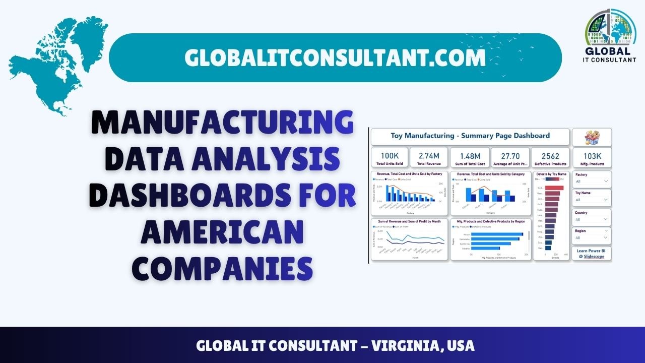
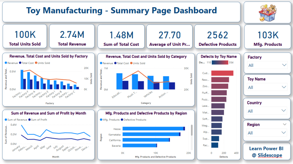
The dashboard shown in the example above is designed around toy manufacturing company data. It demonstrates how production, revenue, costs, defects, factories, categories, regions, and products can be presented through interactive charts and KPI cards.
However, this is only one example.
A similar approach can be used to build custom manufacturing dashboards for companies across North America, regardless of their industry, size, products, or operational structure.
What Is a Manufacturing Data Analysis Dashboard?
A manufacturing data analysis dashboard is an interactive reporting and visualization system that converts raw business data into meaningful charts, KPIs, tables, trends, and comparisons.
Instead of asking managers to analyze spreadsheets manually, a dashboard can provide a centralized view of business performance.
For example, a manufacturing dashboard could show:
- Total production
- Units sold
- Total revenue
- Manufacturing cost
- Profit
- Production efficiency
- Defective products
- Defect percentage
- Factory performance
- Product performance
- Regional performance
- Inventory levels
- Sales trends
- Production trends
- Customer orders
- Supplier performance
The dashboard can also include filters that allow users to analyze the data according to factory, product, category, country, region, month, quarter, or year.
This means management can move from a high-level overview to detailed analysis within a few clicks.
Understanding the Example Manufacturing Dashboard
The dashboard shown above provides a good example of how manufacturing data can be converted into a management-friendly reporting system.
At the top, the dashboard provides several KPI cards.
These include metrics such as:
Total Units Sold, Total Revenue, Sum of Total Cost, Average Unit Price, Defective Products, and Manufacturing Products.
These KPIs immediately communicate the overall condition of the business.
For example, instead of opening a spreadsheet and calculating total sales manually, a manager can immediately see the total units sold.
Similarly, revenue and total cost can be displayed together, helping management understand the financial performance of manufacturing operations.
The dashboard then moves into visual analysis.
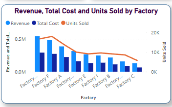
1. Revenue, Cost and Units Sold by Factory
One of the most useful views for a manufacturing business is comparing factories.
A company operating multiple manufacturing facilities may want to understand:
- Which factory produces the most?
- Which factory generates the highest revenue?
- Which factory has the highest costs?
- Which factory sells the most units?
- Are some factories significantly less efficient than others?
A dashboard can answer these questions visually.
For example, the chart can compare revenue, total manufacturing cost, and units sold by factory.
This makes it easier to identify high-performing and underperforming facilities.
A management team could then investigate why one factory is generating lower revenue or higher costs.
The answer might involve production efficiency, labor costs, machine utilization, transportation expenses, product mix, or regional demand.
The dashboard does not necessarily provide the final answer by itself.
Instead, it helps management identify where the question needs to be investigated.
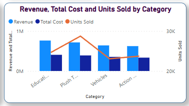
2. Revenue, Cost and Units Sold by Product Category
Manufacturing companies frequently produce multiple categories of products.
A dashboard can compare categories to determine which product segments are contributing most to the company’s business.
For example, a manufacturer might produce:
- Educational products
- Plush products
- Vehicles
- Action products
- Electronic products
- Industrial components
Management could compare revenue and costs for every category.
This can help answer an important business question:
Are our highest-selling categories also our most profitable categories?
The answer is not always yes.
A product category may generate substantial sales but also have high production costs. Another category may have lower sales volume but considerably better margins.
Data visualization allows these relationships to become much easier to identify.
3. Defect Analysis by Product
Quality control is another critical area where data analytics can support manufacturing operations.
The example dashboard includes a visual showing defects by toy name.
A similar visualization can be developed for almost any manufacturing business.
For example, an automobile component manufacturer could analyze defects by:
- Component
- Production line
- Machine
- Factory
- Supplier
- Shift
- Product model
A pharmaceutical manufacturer could analyze quality issues by batch.
An electronics manufacturer could analyze defects by product model or assembly line.
This information can help identify recurring quality problems.
If one particular product consistently has a higher defect rate than other products, management can investigate the production process, materials, machinery, or quality-control procedures associated with that product.
4. Monthly Revenue and Profit Analysis
Manufacturing businesses need to understand not only how much they sell, but also how profitability changes over time.
The example dashboard includes a monthly comparison of revenue and profit.
This type of visualization can help management identify:
- Seasonal sales patterns
- Revenue growth
- Declining revenue
- Profit fluctuations
- High-performing months
- Low-performing periods
- Unexpected changes
For example, revenue might increase significantly during certain months while profit remains relatively flat.
That could indicate increasing production costs, higher logistics expenses, discounts, increased labor costs, or changes in the product mix.
Without visualization, these patterns may remain hidden inside spreadsheets.
With a dashboard, trends can become immediately visible.
5. Manufacturing Products and Defective Products by Region
Geographic analysis is particularly important for companies operating across North America.
A manufacturing organization may operate facilities or distribute products across different states, provinces, cities, or broader regions.
A dashboard can compare production and defective products across geographical areas.
For a North American company, analysis could potentially be organized around:
- United States
- Canada
- Mexico
- Individual states
- Provinces
- Manufacturing regions
- Sales territories
For example, management might discover that one region produces significantly more units but also has a higher defect rate.
Another region may have lower production but better quality performance.
These insights can help management determine where operational improvements may be required.
Interactive Filters Make the Dashboard More Powerful
One of the most important characteristics of a modern data analysis dashboard is interactivity.
In the example, filters are provided for:
- Factory
- Toy Name
- Country
- Region
Imagine expanding this functionality for a real manufacturing organization.
The dashboard could allow users to select a particular:
Factory → Product → Region → Month → Year
The entire dashboard could then update according to the selected filters.
For example, a plant manager could select one manufacturing facility and immediately see its:
- Revenue
- Costs
- Production
- Defects
- Product performance
- Monthly trends
This eliminates the need to create separate reports for every factory.
How a Manufacturing Dashboard Can Help Your North American Business
A customized dashboard can support different departments within a manufacturing organization.
Operations Management
Operations managers can monitor production levels, factory performance, production efficiency, and operational trends.
This can help them identify bottlenecks and areas where production processes may need improvement.
Finance Teams
Finance teams can analyze revenue, costs, profit, margins, and financial trends.
Instead of relying entirely on manually prepared monthly reports, financial information can be presented through interactive visualizations.
Quality Control Teams
Quality teams can analyze defective products and identify patterns by factory, production line, product, supplier, or period.
This can support continuous quality improvement.
Sales Teams
Sales teams can analyze product demand, units sold, revenue, customer regions, and category performance.
This can help identify products and markets generating the strongest results.
Senior Management
Executives generally do not need hundreds of spreadsheet rows.
They need answers to questions such as:
Are we growing?
Which factory is performing best?
Where are our costs increasing?
Which products generate the most revenue?
Where are quality problems occurring?
Which regions are performing better?
A well-designed dashboard can put these answers in front of management in a much more accessible format.
From Excel Reports to Interactive Business Intelligence
Many manufacturing organizations already have valuable data.
The data may exist in:
- Excel files
- CSV files
- ERP systems
- CRM systems
- Accounting software
- Inventory systems
- Production management software
- SQL databases
- Cloud platforms
The problem is often that the information is distributed across multiple systems.
Data analysis and Business Intelligence can bring these sources together.
For example, production information could come from an ERP system while sales data comes from a CRM and financial information comes from accounting software.
A centralized reporting solution can combine these datasets and create a unified view.
This is where tools such as Microsoft Power BI can become particularly useful.
Every Manufacturing Company Needs a Different Dashboard
The example shown here is a toy manufacturing dashboard.
It should not be treated as a fixed template that every manufacturing company needs.
The dashboard should be designed around the company’s actual business questions.
For example, an automobile parts manufacturer may need:
- Production by component
- Machine utilization
- Downtime
- Defect percentage
- Supplier performance
- Production efficiency
- Order fulfillment
- Inventory
- Revenue
- Profit margin
A food manufacturer may need:
- Production volume
- Batch performance
- Waste
- Expiry tracking
- Quality metrics
- Inventory
- Sales
- Distribution
An electronics manufacturer may need:
- Production by model
- Assembly-line performance
- Component usage
- Defect rates
- Warranty claims
- Inventory
- Revenue
- Regional sales
Therefore, the first step should not be choosing charts.
The first step should be understanding the business.
Good Dashboard Design Is About More Than Charts
Creating a dashboard does not simply mean placing several graphs on a screen.
A professional dashboard should answer specific business questions.
The layout should provide a logical flow.
For example:
KPIs → Overall Performance → Factory Analysis → Product Analysis → Quality Analysis → Regional Analysis → Detailed Insights
The dashboard should also avoid unnecessary visual clutter.
Too many charts can make a dashboard difficult to understand.
The objective should be to provide the right information at the right time.
A good dashboard allows an executive to understand the overall situation within seconds and then explore the details when required.
What Data Do You Need to Build a Manufacturing Dashboard?
You do not necessarily need a perfect database before starting.
A dashboard can often be developed using existing business data.
For example, useful fields may include:
| Data Area | Example Information |
|---|---|
| Production | Units manufactured, production date |
| Sales | Units sold, sales value |
| Finance | Revenue, cost, profit |
| Products | Product name, category |
| Factory | Factory name, location |
| Quality | Defective units, defect type |
| Geography | Country, state, region |
| Time | Day, month, quarter, year |
| Inventory | Stock levels, inventory movement |
Once the data structure is understood, appropriate KPIs and visualizations can be designed.
Data Analysis Should Lead to Better Decisions
The purpose of a dashboard is not simply to make data look attractive.
The real objective is decision-making.
Suppose the dashboard shows that one factory has substantially higher manufacturing costs.
Management can investigate the reason.
Suppose another product has an unusually high defect rate.
The quality team can investigate the production process.
Suppose revenue is increasing but profit is declining.
Finance and operations teams can examine the underlying costs.
Suppose one region is showing stronger demand.
The company can investigate whether additional inventory, production capacity, or sales resources should be allocated there.
This is the difference between data reporting and data-driven decision-making.
A Dashboard Can Grow With Your Business
A manufacturing dashboard does not have to remain static.
As the organization becomes more mature in its data analytics journey, additional KPIs and analytical capabilities can be introduced.
For example, the first version may focus on:
Revenue + Cost + Production + Defects
Later, the organization could introduce:
Profitability + Inventory + Machine Utilization + Supplier Performance + Forecasting
Eventually, advanced analytics and predictive models can also be incorporated.
This creates a scalable approach to Business Intelligence.
Our Approach to Manufacturing Data Analytics
At Global IT Consultant, the objective is not simply to create a dashboard that looks professional.
The objective is to understand the organization’s data, identify meaningful KPIs, and create a reporting environment that helps people make better decisions.
The dashboard shown in this article is one example of what can be created from manufacturing data.
Your company may require a completely different dashboard.
We can create dashboards based on your specific:
- Manufacturing processes
- Products
- Factories
- Sales channels
- Financial data
- Quality metrics
- Inventory
- Regions
- Management requirements
Whether your data is currently maintained in Excel, CSV files, databases, or other business systems, the dashboard can be planned around your existing data environment.
Final Thoughts
Manufacturing companies already possess a valuable asset: data.
Production data tells you what is being manufactured.
Sales data tells you what customers are buying.
Financial data tells you what the business is earning and spending.
Quality data tells you where problems are occurring.
Regional data tells you where opportunities may exist.
The challenge is bringing all of this information together in a way that people can understand.
A well-designed Manufacturing Data Analysis Dashboard can transform fragmented operational information into an interactive business intelligence system.
The example in this article demonstrates how a toy manufacturing dataset can be converted into a dashboard showing revenue, costs, production, defects, factories, categories, monthly performance, and regional analysis.
But the same concept can be applied to automotive, electronics, pharmaceuticals, food processing, machinery, chemicals, consumer goods, textiles, packaging, and many other manufacturing industries across North America and globally.
Your manufacturing data is unique. Your dashboard should be unique too.
Want a Custom Manufacturing Dashboard for Your Business?
If your manufacturing company is currently managing business information through Excel spreadsheets, disconnected reports, or multiple data sources, a customized Data Analysis Dashboard can help bring everything together.
Global IT Consultant can help you plan and develop a dashboard around your company’s actual data and business requirements.
If you want to explore what a customized manufacturing dashboard could look like for your organization, contact us and share your requirements.
We can discuss your data sources, KPIs, reporting requirements, and the type of dashboard that would be most useful for your management and operations teams.
Global IT Consultant — Turning Business Data into Actionable Insights.
